Graphing my social graph
Everyone talks about social graphs and their value to large companies and advertisers, but where are the actual pictures for individual users? I got to thinking how one could visualize the “local” part of online social network — just your friends and followers and their relationships — and after a few weekends of tweaking and fiddling, I’ve got a nice Mathematica notebook that does all this and more.
For example, here’s what my Twitter user accountwww.twitter.com looks like:
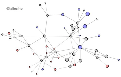
You’ll notice that I do not appear in the graph. I already have an explicit and implicit relationship to everyone in the graph, and so to include me would to distort the graph layout without adding any information at all.
Okay, what do all these visual elements communicate?
-
lines indicate users relationships to each other: solid lines indicate mutual relationships, whereas dotted lines indicate one-way relationships — the dotted end is the party who doesn’t follow back.
-
disk size shows tweet frequency: the bigger the disk, the more frequently a user tweets.
-
color indicates a user’s relationship to me: gray for users I follow that follow me back, blue for users who don’t follow me back, and pink for losers, I mean users, whose overtures I don’t return. Just kidding about the loser part.
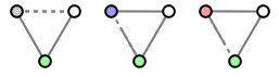
Or, if you prefer a visual legend for this encodign, try figure this out (hint: I’m green)!
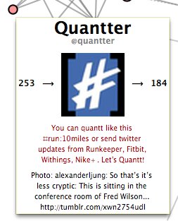
In Mathematica, it’s really easy to create interactive visualizations. You can annotate the graph nodes with tooltips that describe an individual user, showing their latest load-on-demand tweets, avatar, and follower information. I did this for my protoype. Here’s what one of these tooltips looks like:
But this is only the tip of the iceberg. One can easily visualize conversations between users by simply mousing over the edge that connects them. One can click on a user to tweet at them or to go straight to their twitter page. One can weight edges with the frequency of message exchanged between two users. And so on. With a powerful functional languages like Mathematica and its rich set of dynamic UI elements, it’s very easy to take an UX or UI idea and just prototype it, often going from an idea to an implementation in a matter of minutes.
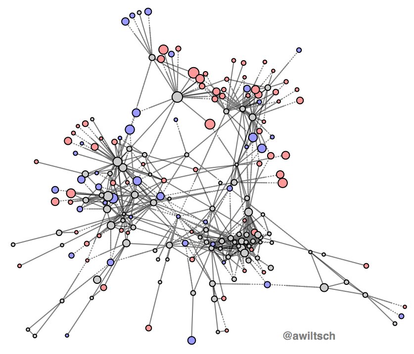
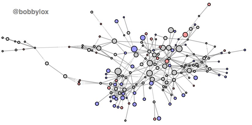
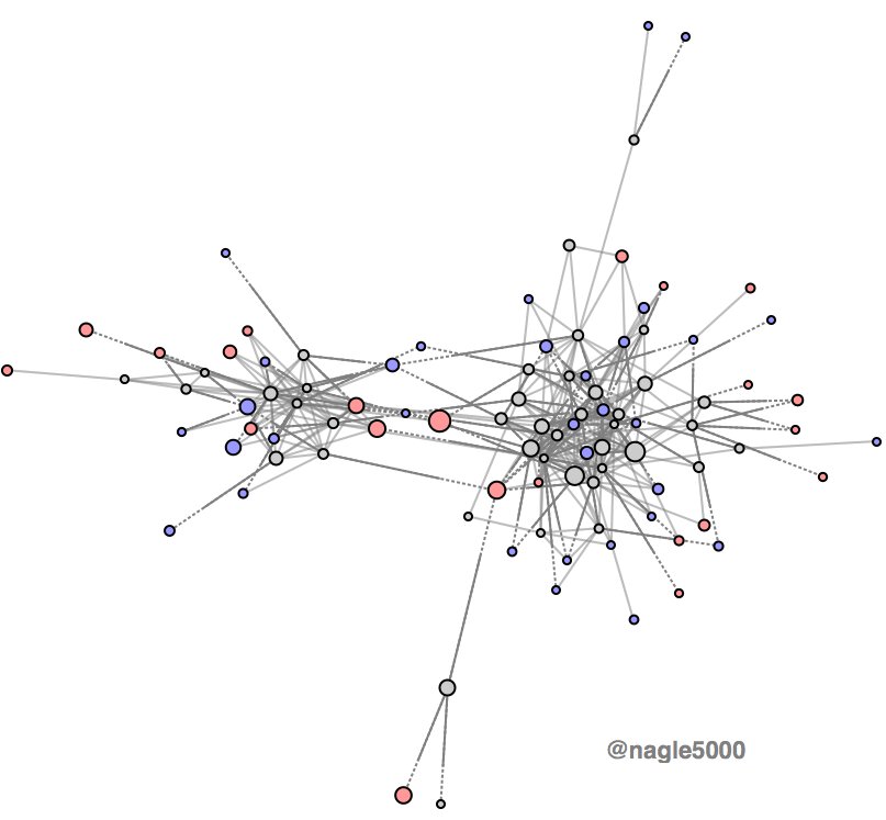
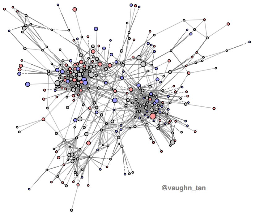
To finish, here is a gallery of the networks of some of my Twitter friends: